- Client: Capital One
- Duration: 2014-2019
- Role: strategic collaboration, branding, prototyping, narrative design and communications, interaction design, motion design, visual design
- Goal: Create a consistent user experience across multiple products and touch points within Bank Retail space, while improving delivery processes.
- Outcome: An enterprise-wide collaborative living system with numerous guidelines for consistent experience across hundreds of products and services, improved development and design processes, faster delivery, and a stronger design culture. The system’s components and design language carried into product work that won Gold at the 2016 [app] design awards (Capital One Mobile).
While I was running Branch Transformation and shipping products across half a dozen platforms at Capital One, the same problem kept coming back: nothing felt consistent. The only real fix was a shared design language and a place to iterate on patterns and components as a team.
Back then, nobody had really pinned down what a “design system” was. We worked out the good practices slowly, iterating alongside our developers and product partners. Two efforts ran in parallel: a top-down push for a global design library, and a set of scrappier bottom-up initiatives where individual teams fixed consistency in their own products.
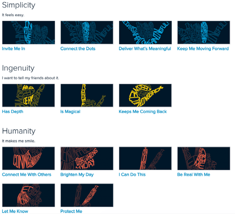
Globally, we’ve started with creating a set of fundamental guiding principles for our design language, the values we wanted our digital experiences to reflect. I have participated in a 2-day workshop with other lead designers, we’ve shared our values with one another and came up with a three design principles and a mission statement for our entire design team.
We built our own styleguide for the Retail Bank products first.
Calling it a design system would be generous. It was closer to a snapshot of our design language across the platforms we owned: iPad and iPhone apps, interactive displays, ATMs.
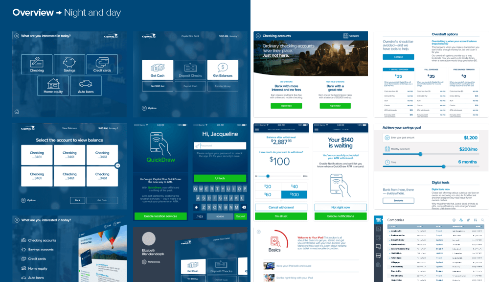
Working closely with developers, we built guidelines and reusable components that let us ship faster and look like one product instead of five. In a branch it’s all one journey anyway, from the check-in kiosk to the cash coming out of the ATM.
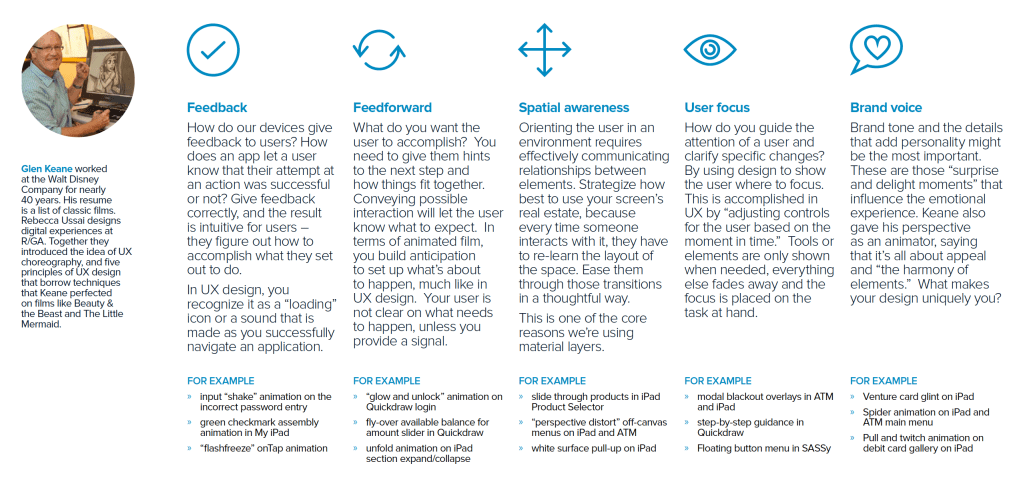
The styleguide covered the usual ground: components, grids, color, type, icons. Plus the parts I cared about most, motion guidelines and a material-layers architecture.
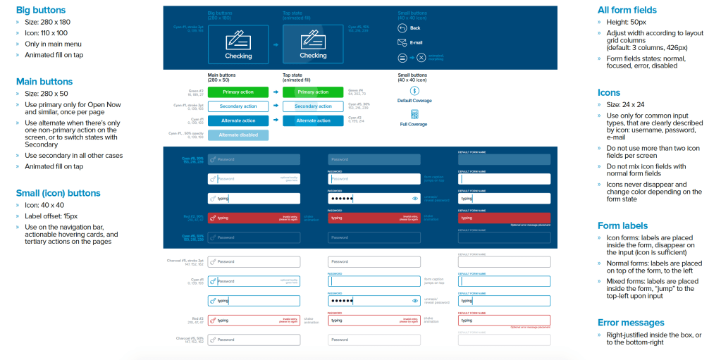
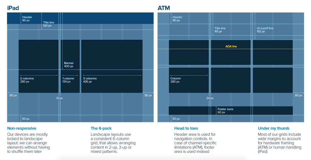
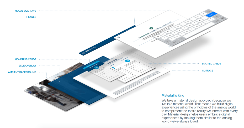

As the design org matured, we folded the local styleguides into one global system. A steering committee of lead designers and product partners from across the company kept pushing the language forward while all of us learned, in real time, how to run a design system at that scale.
Everyone owned a piece of it. I took motion. I wrote the animation guidelines and principles, built the examples and the do’s and don’ts that every designer and developer worked from. That work is also where my “Jedi Principles of UI Animation” talk came from, so it ended up doing double duty.



Once the system was established and a dedicated team existed to maintain it, I turned to something different: a brand for the design org itself.
An identity system for designers. Part of it was sharpening our talent brand and helping hiring, part of it was lining us up with the rest of the company, and part of it, honestly, was making a few hundred designers feel like one team.
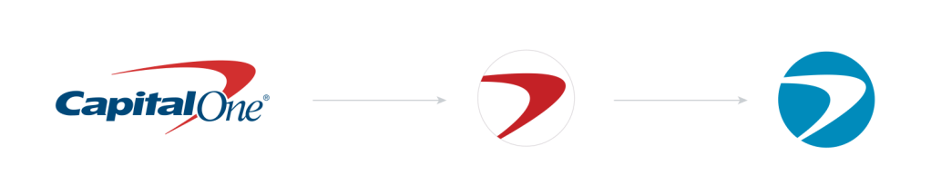
Getting a few hundred designers to agree on anything visual is genuinely hard. Everyone has opinions, and the opinions are strong. On top of that, the design brand had to sit comfortably next to the corporate brand, so we’d read as partners rather than a side project doing its own thing.
It took research, conversations, a lot of meetings, and a lot of iteration, but we got there. And because everyone had a hand in it, there was no dramatic reveal. The org already knew the brand, because the org had built it.
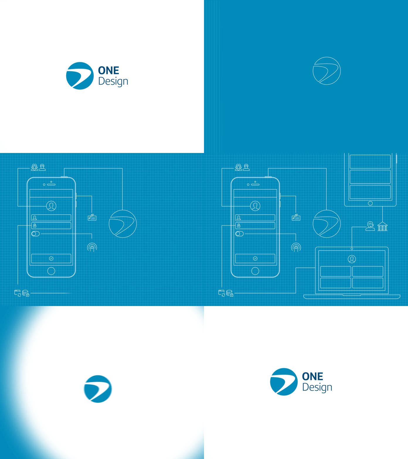
We kept gathering feedback and iterating, then started taking the brand out into the world: conferences, recruiting events, college fairs.
Stickers, brochures, business cards, and apparel for the team. We wanted it to work for everyone, so we actually did the research, and skipped t-shirts because t-shirts never fit everyone well. We went with track jackets and socks instead, and people loved them.

A couple of years after leaving Capital One, I’m wearing a pair of those socks while I write this.
The brand and the system are both still alive over there, and they’ll outlast me. That’s the whole point of building systems instead of one-offs.
 Kit Oliynyk