A postal app that respects your time
A ground-up rebuild of the USPS mobile app: real native iOS and Android instead of a website in a costume, two apps folded into one, and a waterfall team led into research before the feature list got locked. USPS shipped a unified, native Informed Delivery app along these lines, and the platform it fed into now reaches more than 75 million registered users.
- Client
- United States Postal Service, through a federal contractor. A mobile experience for a service almost everyone in the country uses.
- Duration
- 2019. Federal timeline, iterative approach inside a waterfall culture.
- Role
- Head of design. Product strategy, product management, business alignment, narrative and communications.
- Team
- Designers, researchers, and business analysts. Built for 25M+ customers.
Outcomes
- A product strategy, a unified information architecture, and a native-app direction for a postal experience serving 25M+ customers.
- Two apps, servicing and tracking, resolved into one, the thing research kept asking for.
- Real native iOS and Android to replace a slow web-wrapper.
- Stakeholders who rewrote most of the user stories and the whole roadmap around what people actually needed.
- A multi-track sprint schedule and faceted feature analysis, so priorities got set out loud and in one room.
- USPS shipped a unified, native Informed Delivery app along these lines in 2025.
A website in a native costume
The old app was a website wearing a native costume: a web front-end stuffed into a wrapper, slow and clunky, doing neither job well. We replaced it with real native apps for iOS and Android.
The strategy needed work too. USPS ran two separate apps, one for servicing and one for tracking your mail, and research kept saying the same thing: people wanted one app, not two. Then there was the culture gap. The team was used to waterfall, where everything is planned up front and nothing surprises you, and a research-led, iterative approach felt risky by comparison. Most of the feature list was locked before anyone had done the research to back it up.
Start with the people
It is easier to change direction before anyone has fallen in love with a design.
Millions of people use the postal service, all of them differently, and we had to design for that range without blowing the federal timeline. After a few dozen interviews, three people kept showing up:
Mohammed, a logistics manager who ships on behalf of his company, a power user who wants full control while saving time. Chen, a small-shop owner who ships to customers and needs to know her packages arrive on time. Tyrone, a regular person who rarely ships but often receives, and is not familiar with postal services at all.
Personas, scenarios, and journey maps were new to our partners, so we did not hide the work. We shared the process, explained the reasoning, and over time they came around. Eventually they trusted us enough to rewrite most of the user stories and the whole roadmap around what people actually needed.
Nothing precious
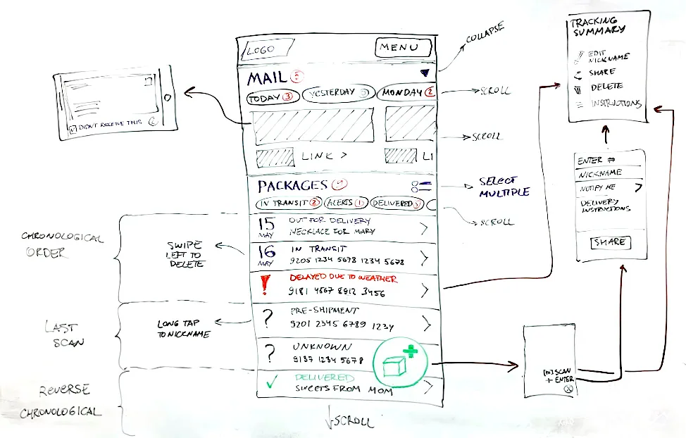
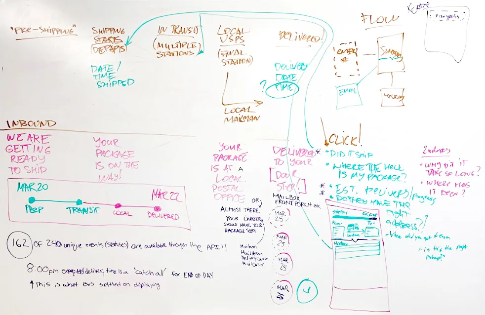
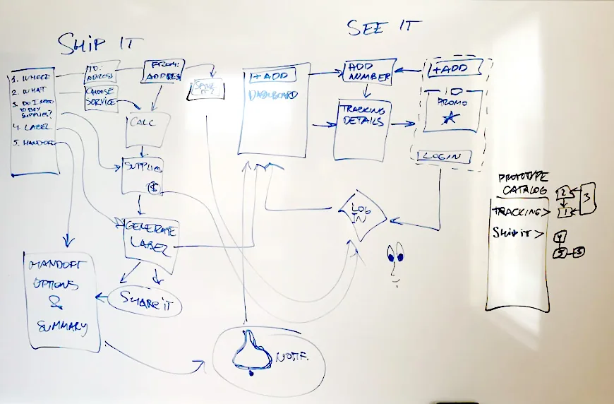
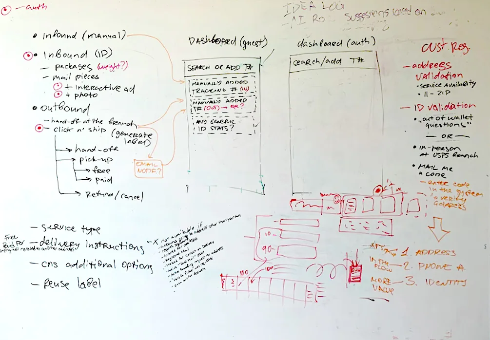
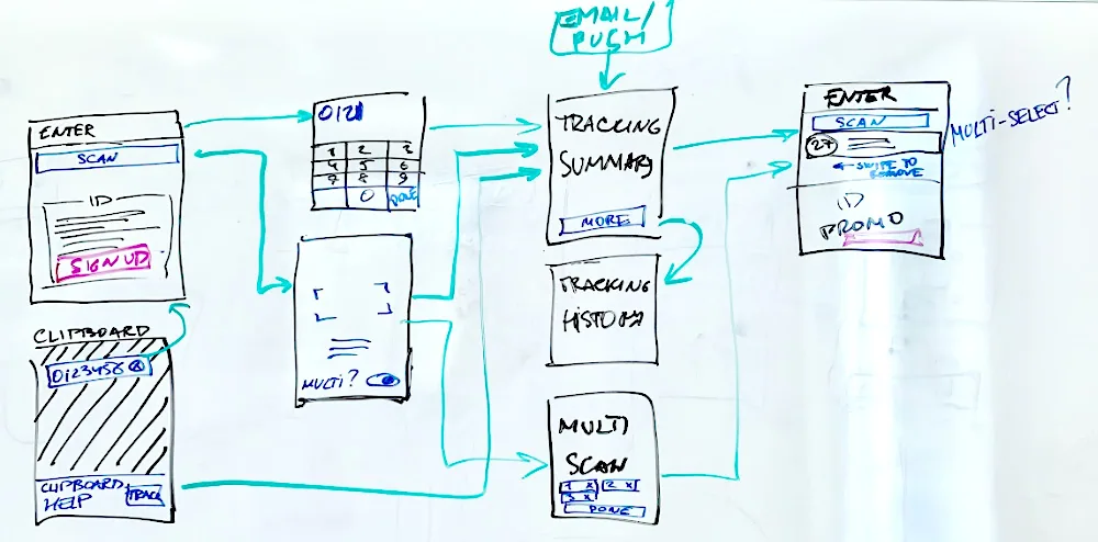
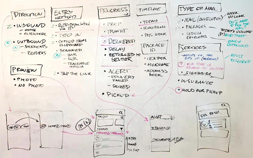
We were a small team facing a fair amount of potential pushback, so I kept everything in low fidelity. Paper, whiteboards, nothing precious. It is easier to change direction before anyone has fallen in love with a design.
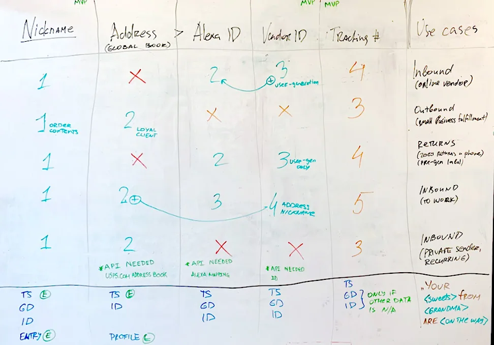
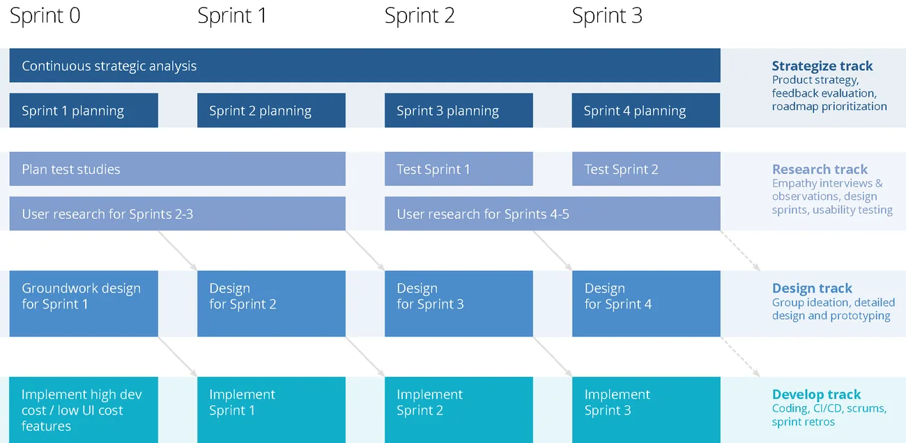
The inherited feature list also meant rethinking how we ran sprints. I brought in faceted feature analysis so we could rank features as a team, weighing user need against build difficulty against business priorities, all in one room and out loud. I set up a multi-track sprint schedule so research kept feeding design while we kept showing the work to stakeholders. There were no big reveals, which is the whole point. People who see the work evolving do not get ambushed by it.
Prototype in code
My goal was to prototype in code as efficiently as possible instead of producing too many high-fidelity artifacts. I coached the team to work side by side with our engineers, building reusable components and iterating on the experience together.
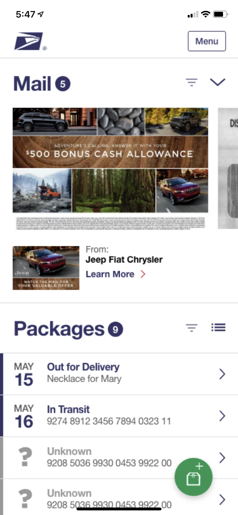
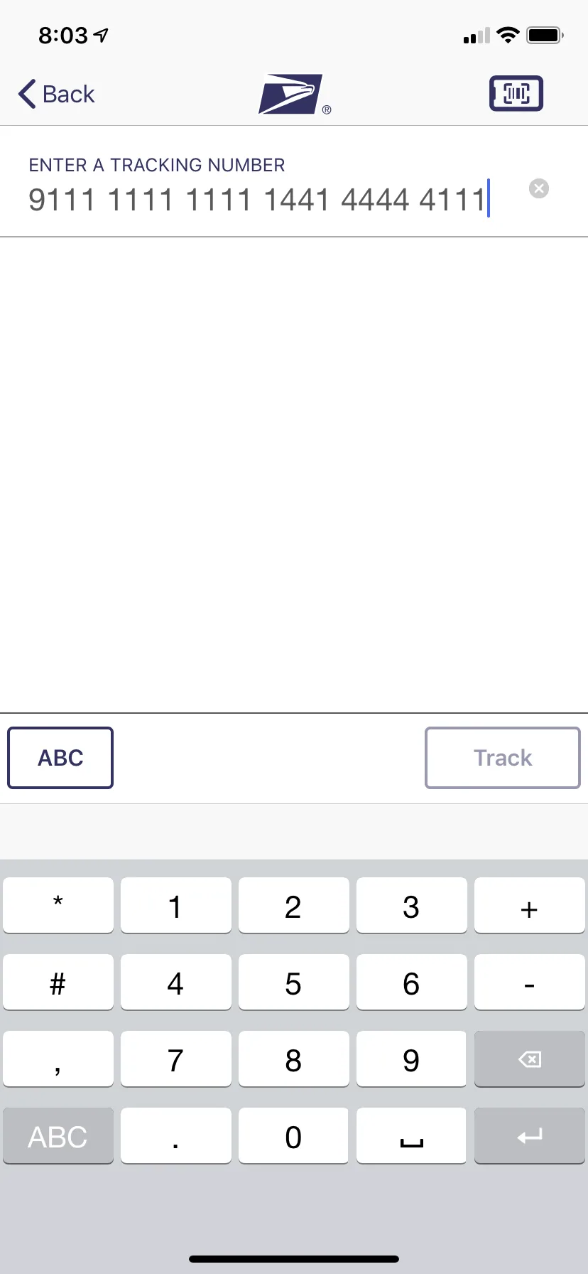
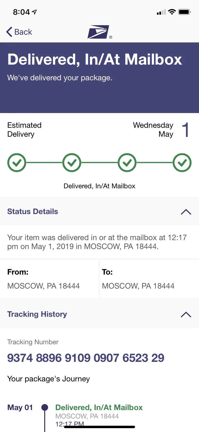
Within a few weeks we sketched a new product roadmap and updated the feature set to match what customers needed. Together with our stakeholders we redefined the information architecture and the application flow, introduced a human-centered content strategy to help customers like Tyrone feel confident, and designed a centralized dashboard so customers like Chen and Mohammed stay in control of their shipments.
Not glamorous, but real
An app that respects a person's time, at the scale of the country's mail. Not a glamorous goal, but a real one.
I handed it off and the work kept moving. USPS shipped a unified, native Informed Delivery app along these lines, one app, native, built around what people actually do with the mail.
Where it landed
The platform this direction fed into kept growing. We designed for 25 million. Today it reaches three times that, business use of it climbs more than 30% a year, and somewhere between 10,000 and 30,000 campaigns run in a given month.